The Re-imagination of Joiner
- engineering
Contents
The Task
Joiner started out modestly. Our UI had weird, funky colors, the recommendation system was dysfunctional, and you couldn't link your game profiles to your real-world stats. Since then a lot has changed: we've made countless UI changes, redesigned our core infrastructure many times, shifted frameworks, and even database structures.
In this article we'll share our journey of re-imagining our app, an go into detail about some design decisions we made to benefit our users.
Keep in mind, Joiner is my side-project while I'm still in high school. I'm not an expert, and I just wanted to share my thinking and progress while I learn and develop my software engineering skills.
Where it started
If you can believe it, our UI used to look like this:
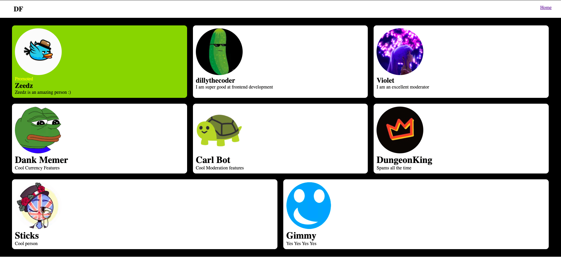
A REALLY old UI
Pretty bad, right? Joiner has come a long way since then. We've undergone tons of refactors, UI changes, and infrastructure pivots. In the above image, Joiner was running on a plain Express server with EJS. Yes, that's right: EJS. Mind you, this was just for the proof of concept, but it's crazy to think just how much we've changed.